NYC Shootings Tableau Dashboard
As a NYC resident, I wanted to create a dashboard regarding NYC data. I found a dataset regarding NYC shootings on NYC Open Data that I thought would make a good Tableau dashboard project.
Link to NYC Dataset: Click Here
Approach
Data Cleaning
- Loaded the dataset into a Pandas Dataframe in a Jupyter Notebook for data cleaning
- Checked for outlier values and nulls in each column, all outlier values were fixed and null values were filled in
- Filtered out unnecessary columns and rows of data that were not needed in my dashboard
- Changed the structure of the original dataset by splitting it into two separate CSV files that can be joined together
Link to Data Cleaning: Click Here
Dashboard Creation
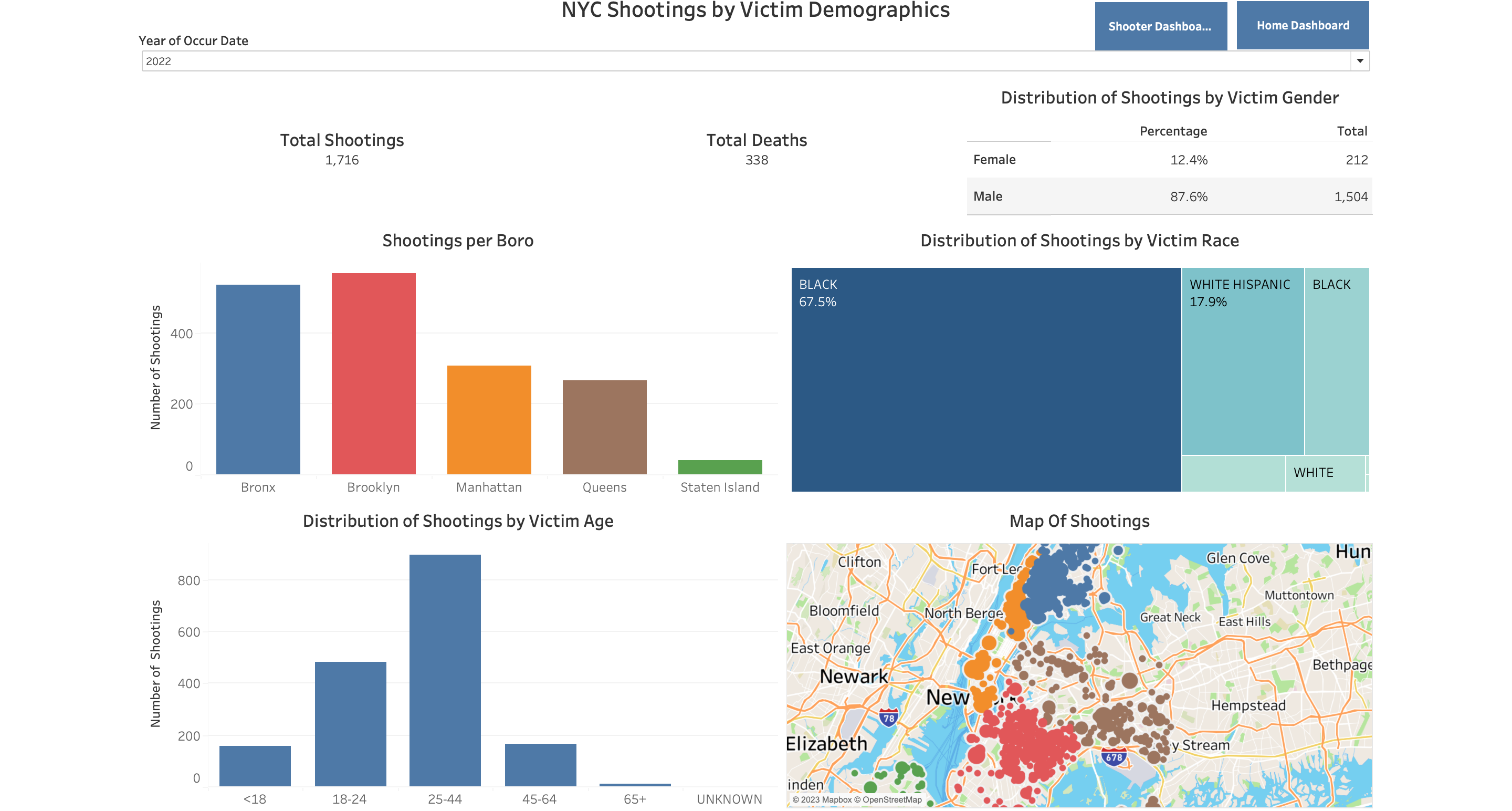
- Connected the two clean CSV files and a shapefile of the nyc boroughs to tableau
- Created a tableau data model on the 3 data sources by using features like relationships and inner joins
- Constructed 3 dashboards by combining multiple visuals from multiple sheets, each sheet contains one visualization, visualizations include bar graphs, maps, pie charts and tree maps
- Implemented dynmaic filtering for the dashboards using action filters
- Made navigation buttons to switch between dashboards
- Used Tableau's story feature to create a presentation of insights on each dashboard
Link to Project in Tableau: Click Here